Lorem ipsum dolor sit amet, consectetur adipisicing elit. Sint ratione reprehenderit, error qui enim sit ex provident iure, dolor, nulla eaque delectus, repudiandae commodi. Velit assumenda odit quisquam at, error suscipit unde, necessitatibus ipsum ratione excepturi ducimus labore, totam dolorem.
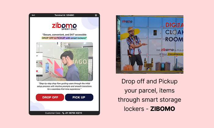
This project involved the end-to-end UX design and optimization of a smart locker interface used for secure item drop-off and pickup. The primary objective was to create an intuitive, seamless, and secure experience for users interacting with the locker system, whether dropping off or retrieving their items.
The design challenge was to simplify complex flows—such as facial authentication, payment handling, and locker access—into a smooth, step-by-step interface that minimized friction and reduced user error.
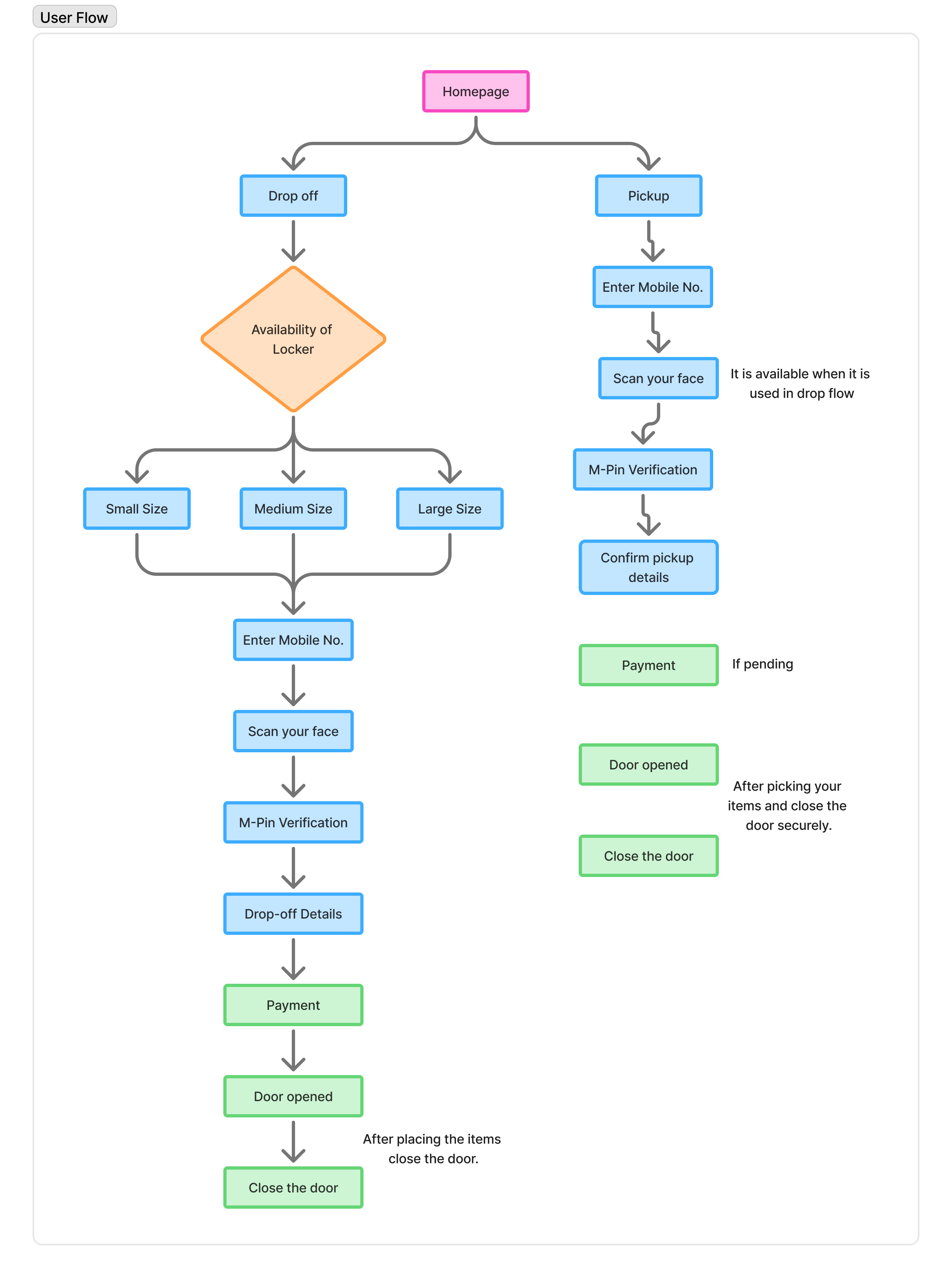
Two primary user journeys were addressed:
Drop-off Flow: From homepage to selecting locker size, mobile number entry, biometric face scan, M-PIN verification, drop-off details, payment, and automatic locker access.
Pickup Flow: From homepage to biometric authentication, pickup confirmation, optional payment handling, and secure locker retrieval.
Special attention was given to usability, accessibility across both flows. The final experience focused on speed, clarity, and user confidence, ensuring users could interact with the system independently and without confusion.
User Research:
User Interview:
Participants
2 participants
Age range: 20–55
Mixed tech familiarity (from first-time users to experienced tech users)
Included user having experience in using digital menu boards.
Key Research Questions:
How comfortable are users with biometric verification (e.g., facial scan)?
What are their expectations when accessing a locker for drop-off or pickup?
What points in the journey feel confusing or time-consuming?
Do users understand the instructions and flow without assistance?
What concerns do they have about security or payment?
Key Findings & UX Solutions:
Biometric Anxiety: Users felt unsure if the face scan was successful, especially in low-light conditions or if there was no immediate feedback.
✅ Added real-time visual feedback (e.g., progress bar, "Face scan successful" message).
Instruction Clarity: Users missed important instructions like “Confirm drop-off details” and “Close the locker door.”
✅ Replaced text-only prompts with icon-based visual icons, animations, and on-screen confirmations at each step.
Too Many Drop-off Steps: The drop-off journey felt longer and slightly overwhelming for new users.
✅ Simplified the flow by combining related screens (e.g., mobile number + locker size), and removed redundant confirmation screens.
Pickup Not Feeling Instant: Users expected pickup to be faster than drop-off but found the process similar in length.
✅ Reduced the number of pickup steps.
Security Concerns: Users were unsure if the locker door closed or locked properly after use.
✅ Added a "Locker Closed & Secured" confirmation screen with sound and visual confirmation. Also included a small LED indicator on the locker itself.
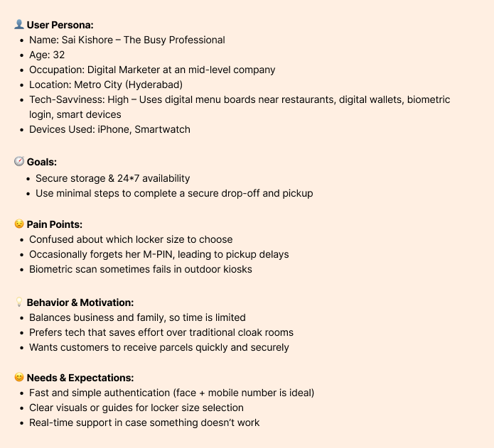
User Persona:
User Journey Map:
User Journey Map(Drop Flow):
Step
Description
User Goal
Emotions
Pain Points
Opportunities
Homepage
User selects "Drop-off"
Start the process
Curious, slightly unsure
May not know what to expect
Clear CTA and intro message
Locker Size Selection
Chooses appropriate locker size
Find the right fit for their item
Neutral
Confusion if sizes aren't visualized
Add size guides or images
Mobile Number Entry
Enters mobile number for identification
Continue with identity verification
Focused
confusion about format or verification
smart validation, and error correction
Face Scan
Face recognition step
Verify identity securely
Slight discomfort
Poor lighting or camera angle
Visual feedback during scan
M-PIN Verification
Enters 4 digit secure code
Add extra security
Focused
May forget or mistype
Option to view PIN briefly
Drop-off Details
Adds notes/instructions
Ensure proper handling
Confident
Text area not obvious
Clear labels, optional examples
Payment
Completes any required payment
Finish transaction
Slight anxiety (payment step)
Slow or unclear payment method
Add payment feedback and multiple options
Locker Access
Locker opens automatically
Drop item inside
Relieved, accomplished
Delay in access timing
Confirmation animation/audio
User Journey Map(Pickup Flow):
Step
Description
User Goal
Emotions
Pain Points
Opportunities
Homepage
User lands on the main screen and selects “Pickup”
Begin parcel retrieval
Focused, task-oriented
Confusion with Drop-off option
Clear visual separation between Pickup and Drop-off
Mobile Number Entry
Enters mobile number for identification
Continue with identity verification
Focused
confusion about format or verification
smart validation, and error correction
Face Scan
User performs a face scan
Authenticate for parcel retrieval
Calm or slightly nervous
Recognition failures; poor lighting
Fast, robust facial recognition with retry and help options
Pickup Confirmation
System shows parcel details; user confirms to proceed
Confirm correct item before retrieval
Confident, relieved
Confusion if multiple items or unclear info
Item image, description, and optional preview via app
Payment
Make any outstanding payments
Fulfill all requirements before access
Neutral to anxious
Unexpected payment; lack of clarity
Explain charges transparently; one-tap payment support
Locker Access & Retrieval
Locker opens automatically for the user to retrieve the parcel
Get parcel and exit quickly
Relieved, successful
door won’t open, or technical delay
Live chat/help; locker sensor feedback; satisfaction check post-retrieval
Task Flow:
Design System:
Font Family: Helvetica Neue
Type Scale:
H1 – Heading 38px Bold
H2 – Subhead 30px Medium
Body Text 24px Regular
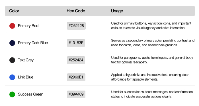
Colour scheme:
Design Pattern:
Pattern: Step by step progress indicator
Use Case: Show a progress indicator that tracks the stages of the drop flow, from checking the availability of lockers step to place the items in a box and close the door step.
Purpose: Reduce user anxiety by keeping them informed about the status of their dropping the items process.
Example: A progress bar with stages like "Mobile No. successfully verified"," Facial Authentication completed"," MPIN Successfully Created",“Payment Successfully completed” and “Locker closed successfully"
E.g.:
UI Mockup Designs:
Drop Flow:
Prototype Link:
Pickup Flow:
Prototype Link:
Usability Testing:
Drop Flow
Completion Time(session time): 3 minutes, 1 second
User Actions:
Mobile No. verification
Facial Authentication(optional)
Mpin setup
Payment
Placing items in locker
Closing Locker
Observations:
User hesitated at the Facial authentication, as it taken 26 seconds.
Payment process took 30 seconds.
Pickup Flow
Completion Time(session time): 33 seconds
User Actions:
Mobile No. verification
Facial Authentication(optional)
Mpin setup
Locker details Review
Payment(if pending)
Take away items from locker
Close the Locker
Observations:
Facial authentication took 16 seconds.
UI/UX Recommendations:
Integrating Audio: "Please collect your items and close the door"


Understanding WCAG 2.1: Enhancing Web Access...
Heuristic Evaluation for Better UI/UX Design...
The Art of Minimalism...